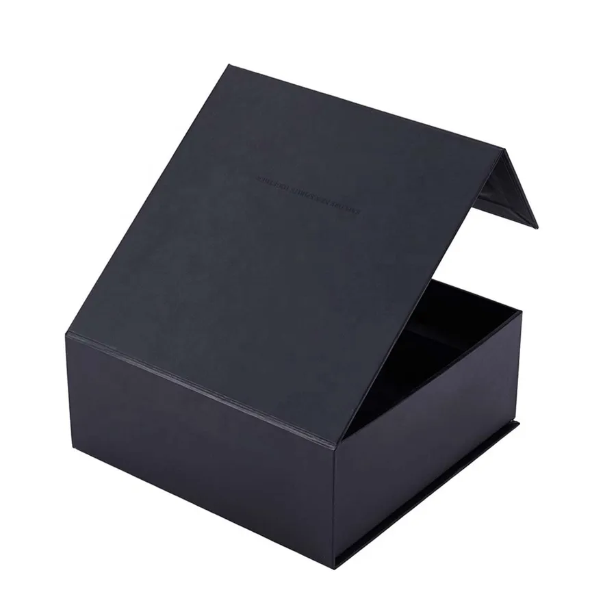
Foil, Embossing, Soft Touch and Linen: Finishes for Rigid Boxes
What each finish does on a wrapped rigid box, where it works best, and how to set up artwork for it.
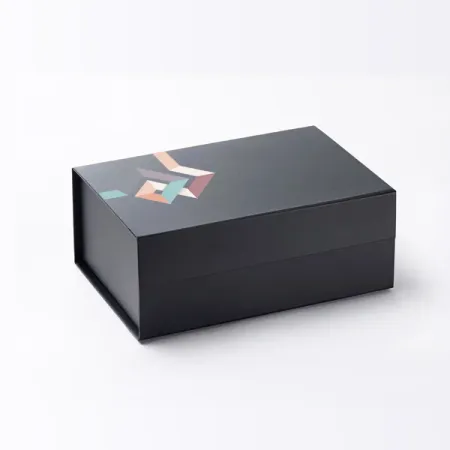
Where a finish goes on a rigid box
Every finish on a rigid box is applied to the wrap paper, not the board. The paper is printed, finished and then glued round the greyboard.
That order matters. A foil or deboss pressed into the flat sheet keeps its edges, and the board behind it then gives a deboss real depth.
Wrap papers for finishing are usually 120 to 157 gsm. Thinner papers can show the board edge through a heavy deboss, so finishes are planned with the paper.
The inside lining paper can take finishes too. Most buyers save them for the lid and front, where eyes land first.
Should I choose matt, gloss or soft touch lamination?
Lamination is a thin film bonded over the printed wrap. It protects the ink from scuffs and sets the base feel of the box.
Gloss film deepens colours and shows fingerprints less on dark shades than you might expect. Matt film flattens the shine and suits muted, quiet designs.
Under bright shop lighting, gloss can glare across a lid photo. If your boxes will appear in product shots, matt or soft touch photographs more evenly.
Soft touch is a matt film with a velvety surface. It is the finish most people stroke when they first pick a box up. It does mark more easily, so it suits boxes handled with care, like luxury boxes for keepsake gifts.
How does foil blocking work on a wrapped box?
Foil blocking presses a thin metallic or coloured foil onto the wrap with a heated metal die. The foil sticks only where the die touches.
Gold, silver, copper, rose and coloured foils are options on request, and foil can sit on laminated or uncoated paper. Fine lines should be at least 0.3 mm thick, and small text no lighter than about 6 pt.
Foil is a flat, solid colour. It cannot show a gradient or a photo, so a logo with shading needs simplifying to one solid shape first.
A single foil logo centred on the lid is the most common choice. On corporate gift boxes with foil logos, many teams add a second small foil mark on the inside flap.
Plan foil size against the lid, not the screen. A logo about a third of the lid width usually reads well from arm's length without crowding the edges.
Embossing and debossing compared
Embossing raises a shape out of the surface. Debossing presses it in.
On rigid boxes, debossing tends to work better, because the greyboard behind the wrap supports the pressed area. A deboss of about 0.5 mm reads clearly in raking light.
A blind deboss has no ink or foil, just the shape, which suits tone-on-tone designs. Pair a deboss with foil for a metallic mark set slightly below the surface. Many jewellery boxes with debossed lids use this look.
Spot UV: shine on a matt surface
Spot UV is a clear, glossy coating printed only on chosen areas. Over matt or soft touch lamination, it makes a logo or pattern shine when the box tilts.
It is a flat gloss, so it adds shine but very little height. You feel a faint change of surface rather than a raised edge.
Keep lines at least 0.5 mm wide and leave about 1 mm between spot UV and any fold line. A coating that crosses a fold can crack when the wrap turns over the board edge.
Spot UV works well on patterns, such as a repeated monogram across a black lid. In flat light the pattern almost disappears, then catches the eye as the box moves.
When do textured or linen-look papers work best?
Textured wrap papers, including linen-look grains, are options on request. They give a tactile surface without any film on top.
They take foil and debossing very well, because the texture frames the smooth pressed area. They print full colour less well, as the grain breaks up solids and fine type.
Because there is no film, textured papers can pick up marks from oily fingers on pale shades. Darker colours hide handling far better.
Most textured boxes use a coloured paper with one foil or a blind deboss. That pairing suits wedding and invitation boxes, where a quiet surface feels right.
Rigid box finishes at a glance
Use the table to shortlist one or two finishes before you brief the artwork.
| Finish | What it looks like | Works on | Watch for |
|---|---|---|---|
| Gloss lamination | Bright, shiny, deep colour | Printed wraps | Glare under shop lights |
| Matt lamination | Flat, low sheen | Printed wraps | Darker shades look slightly muted |
| Soft touch | Velvety, matt feel | Printed wraps | Marks from rings and nails |
| Foil blocking | Metallic or coloured mark | Laminated or uncoated paper | Lines under 0.3 mm break up |
| Debossing | Pressed-in shape | Most wraps over greyboard | Very fine detail fills in |
| Embossing | Raised shape | Thicker wrap papers | Can flatten under weight |
| Spot UV | Glossy areas on matt | Matt or soft touch film | Cracks if it crosses a fold |
| Linen-look paper | Woven texture, no film | Foil and deboss | Full-colour photos lose detail |
Which finishes work well together?
Two finishes usually beat four. One surface, plus one mark that catches light or touch, keeps the box calm.
Choosing a style as well? Our guide to how each rigid box construction opens helps you see where the finished panels will sit.
- Soft touch lamination with a gold foil logo: the most requested pairing for gifts.
- Black textured paper with a blind deboss: dark, quiet, almost no ink.
- Matt lamination with spot UV on a repeating pattern: subtle until the box moves.
- Linen-look paper with foil plus deboss on the same logo: depth and shine together.
- Gloss lamination alone on a bright photo print: lets the image do the work.
How to prepare artwork for finishes
Finishes need their own artwork layers, because each one is made with a separate die, plate or screen.
No artwork yet? Upload a logo on Design Your Box on our site and our designers place it for free.
- Build the wrap artwork to the dieline we send, with 3 mm bleed beyond the cut.
- Extend colour into the turn-in, the 15 to 20 mm that folds inside the walls.
- Put each finish on its own layer, named foil, deboss or spot UV.
- Fill finish shapes in 100 per cent of a single spot colour, with no tints or gradients.
- Keep finish shapes as vectors and convert all fonts to outlines.
- Send a flat PDF of the artwork and the layered file together.
Common finishing mistakes
Placing a foil logo across the lid hinge is the classic one. The foil cracks the first time the lid opens.
Another is very fine serif type in deboss on a textured paper. The thin strokes vanish into the grain, so choose a heavier weight or increase the size.
Foil on a busy printed background is another. A gold logo over a photo can disappear, so give it a calm patch of colour to sit on.
Finally, check the inside. Finishes on the inside of a lid are possible, but plan them on the proof, because the inside wrap is a separate sheet.
Ask for the finishes to be marked on the proof in a different colour from the print. It is the easiest way to spot a foil or spot UV area in the wrong place.